A logo or wordmark helps create a clear identity and becomes a symbol that provides immediate recognition of an institution. This section outlines how the official university logo, unit signature system and other official graphic identifiers should be used to present a consistent, coherent visual identity for SUNY Oneonta.
Usage Guidelines
- The primary university logo is used as the representative mark of the university as a whole. No custom logos of any kind should be created without prior approval by Communication and Marketing. The primary logo is preferred for all uses, especially on collateral that will be distributed regionally or nationally.
- Recognized student organizations (Student Association-funded clubs, honor societies, fraternities and sororities, etc.) may not use any official SUNY Oneonta logos within their organization’s logos or marks with the exception of logos provided by Communication and Marketing under the university signature system. (See example below.)
- SUNY Oneonta employees and students are not permitted to use the university name, logo or official graphic identifiers in the promotion or endorsement of any political/social movement or candidate for public office, or for any activity not officially sponsored by the university.
- Companies that do business with the university are not permitted to promote their products or advertise their services using SUNY Oneonta logos and/or official graphic identifiers unless specifically granted permission to do so by the university. Such permission is typically granted for a limited time, and all materials must be approved by Communication and Marketing.
Logo Downloads
Members of the SUNY Oneonta campus community can access downloadable logo files for print, digital and Microsoft Office applications via the Communication and Marketing intranet site.
Vendors and other external third parties should contact the Office of Communication and Marketing at 607-436-3317 to gain access to university logos and graphic identifiers.
University Logo
SUNY Oneonta has adopted a new primary university logo, effective Jan. 1, 2025. The new university logo has two parts: a logomark and a logotype.
The logomark is a graphic representation of the top of the university pillars, an iconic campus landmark that represents both the university’s history and present-day student experience. Rescued from the university’s original building, Old Main, and installed on the upper part of the Academic Quad, the pillars are now part of a unique campus tradition. Each semester, new students walk together through the pillars to represent the start of their SUNY Oneonta journey. As graduating seniors, they pass through the pillars again, this time in the opposite direction, signifying the end of their time at SUNY Oneonta.
The logotype is the university’s name, SUNY Oneonta, set in the Archer Bold typeface. The primary logo includes “State University of New York” underneath SUNY Oneonta, set in the Whitney Semibold Small Caps typeface. A secondary version without “State University of New York” is also available for uses where the target audience is already familiar with SUNY.
Flexible Formats
The new university logo is designed to offer flexibility for a variety of uses. Approved variations include a vertical orientation with the pillars logomark above rather than next to the logotype, an all-white version for cases where the logo will be placed against a colored or dark background, and a version where the logotype is stacked rather than all on one line.
Usage Guidelines
None of the primary and secondary university logo variations should be recolored, stretched, or modified in any way.
When reproducing the logo, be sure to observe the clear space requirements, leaving space equivalent to the width of the larger pillar on all sides (or 15% of the size of the graphic).
In general, the black and red logo should be used on light colored backgrounds, and the white version should be used over dark colors or photography to provide ample contrast.
It is important that background colors provide sufficient contrast with the logo for ADA compliance as well.
If it is necessary that the logo be reversed out of a multi-colored background or a photograph, it is important that the logo stands out clearly. Avoid the placement of the logo against backgrounds from which it cannot be clearly distinguished.
The logotype may be black instead of red or white for cases where color is not available, such as a black and white newspaper ad.
Any combination of design elements and text used in marketing materials, apparel, merchandise and promotional items are considered a graphic and are not a logo.
An on-brand graphic may be designed for special events, but it must be accompanied by the primary university logo or a unit signature elsewhere on the piece.
Contact Communication and Marketing if you are unsure about logo size, background or placement.
Signature System
Brand strength is increased when all units associate themselves with the university through a consistent logo system. Communication and Marketing does not support the creation or use of custom logos for schools, departments, programs or offices that fall under the umbrella of the university. Instead, a logo should be created within the signature system.
Usage guidelines:
Organizational units within SUNY Oneonta may not create their own logos, word marks or other unique identifiers. The approved identifier for offices, departments and the like consists of the primary university logo with the name of the unit set in the Whitney medium font, colored black, under the logotype. University letterhead reflects this design. The Office of Communication and Marketing will adapt this design, upon request, for other placements and uses.
Exceptions are allowed in a handful of cases, where the entity has a regional or national reputation, communicates primarily with external audiences, and can demonstrate that recognition as an entity that is affiliated with the university but has its own sub-brand identity will support its strategic objectives. Examples include the Biological Field Station and the ExCL Center.
Multiple signatures should not be used in combination in a single publication. In the case where multiple units need recognition, use the university logo and identify the units by name in type only.
The pillars logomark may be appropriate for certain uses. Contact Communication and Marketing to discuss.
Other Official University Identifiers
In addition to the primary university logo, SUNY Oneonta has two official graphic identifiers with specific uses: the university seal and the fire-breathing dragon, with or without the word Oneonta. No other graphic may identify SUNY Oneonta, and each has a different use. The university logo and official graphic identifiers may not be used in combination with one another, nor may any be incorporated into another logo.
University Seal
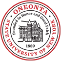
The university seal is reserved for our most formal communication, which is defined by having as one of its primary goals the presentation or connotation of seriousness, officiousness, solemnity, reverence or scholarship. Programs for institutional events such as commencement or the annual Community of Scholars reception, and diplomas, certificates of recognition, and other official citations are examples of formal communication.
Athletics Dragon
The fire-breathing dragon with the word Oneonta set in the Oneonta Regular typeface is reserved for Department of Athletics use, including scoreboards, athletes’ apparel, athletics facilities and communications. The Fast O and plain red dragon are also used widely by Athletics but are considered spirit elements that can be used more broadly by the campus community.
Non-varsity sports clubs may not use the Athletics Dragon or the Oneonta Regular typeface (see the Typography section). Communication and Marketing can advise on graphics for club sports. Any Student Association-recognized club sport that is also a varsity sport must use the word “club” before the sport name (e.g., “Men’s Club Soccer”).
Spirit Elements
Communication and Marketing can advise on designs that incorporate these graphics.
Communication and Marketing has developed additional dragon-themed graphics for use on stickers, T-shirts and other collateral to demonstrate school spirit. Downloads are available on the Communication and Marketing intranet site.
Guidelines
The Fast O should not be used to represent the letter O in a word.
If you use a spirit element that does not include "SUNY Oneonta," you must also use the primary university logo elsewhere on the piece, but they should not be combined to display as a single element.
Spirit elements may not be modified or recolored, with one exception: every spring, the red dragon turns green in celebration of Green Dragon Week. The green dragon may be used temporarily in promotional materials about Green Dragon Week events.
Mascot
SUNY Oneonta’s mascot is Red the dragon. Photos of Red against a white background in various poses may be used in university communications. Downloadable files are available on the Communication and Marketing intranet site.
Other authorized representations of the university mascot are outlined in the Athletics Dragon and Spirit Elements sections.
Mascot caricatures are not permitted—the mascot may be featured only in the ways shown in this guide.


